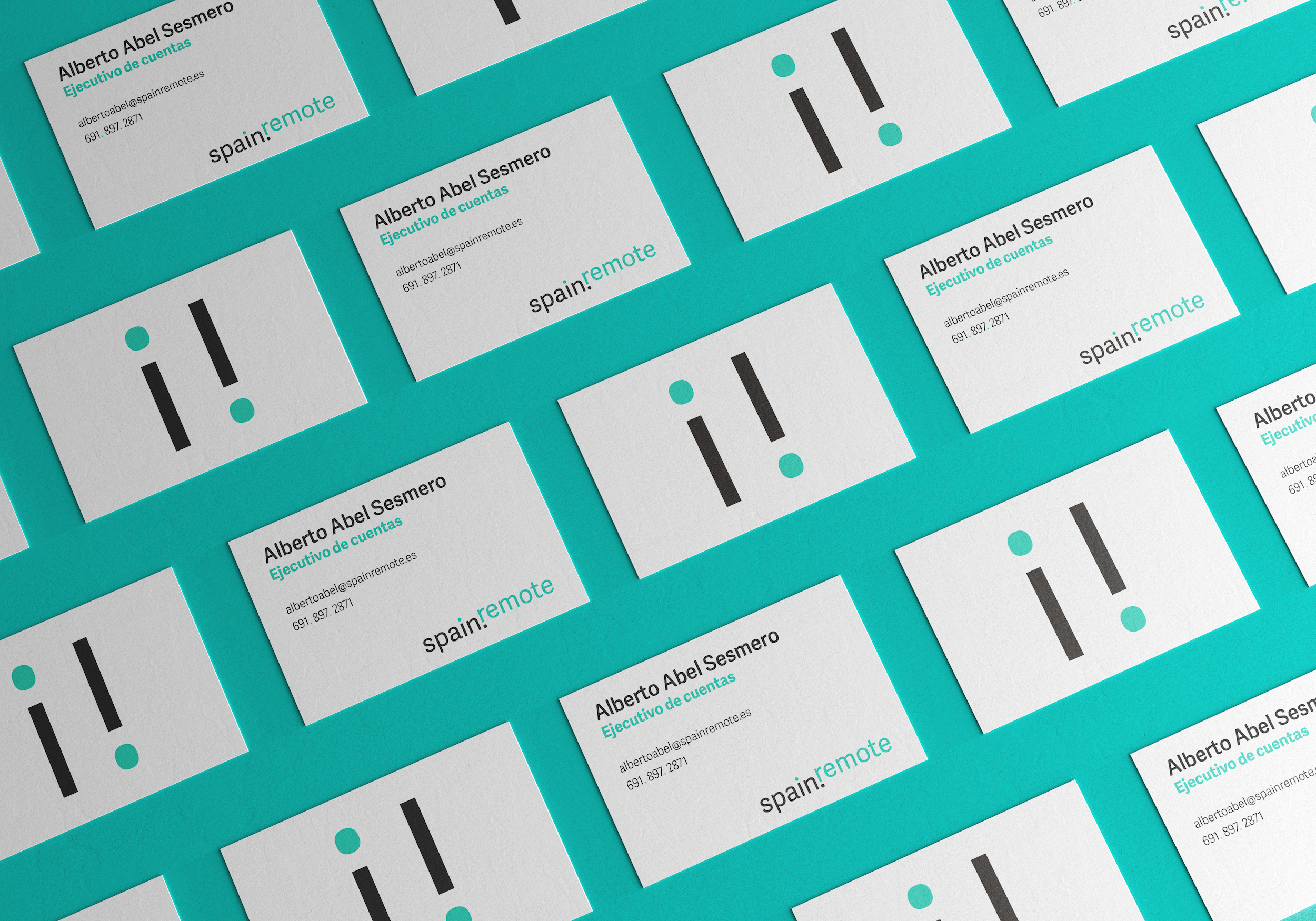
logotype | isotype | corporate stationary
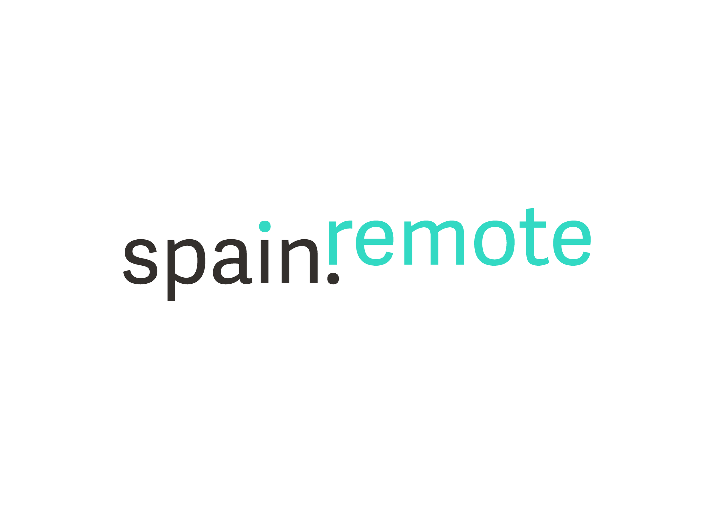
Spain Remote
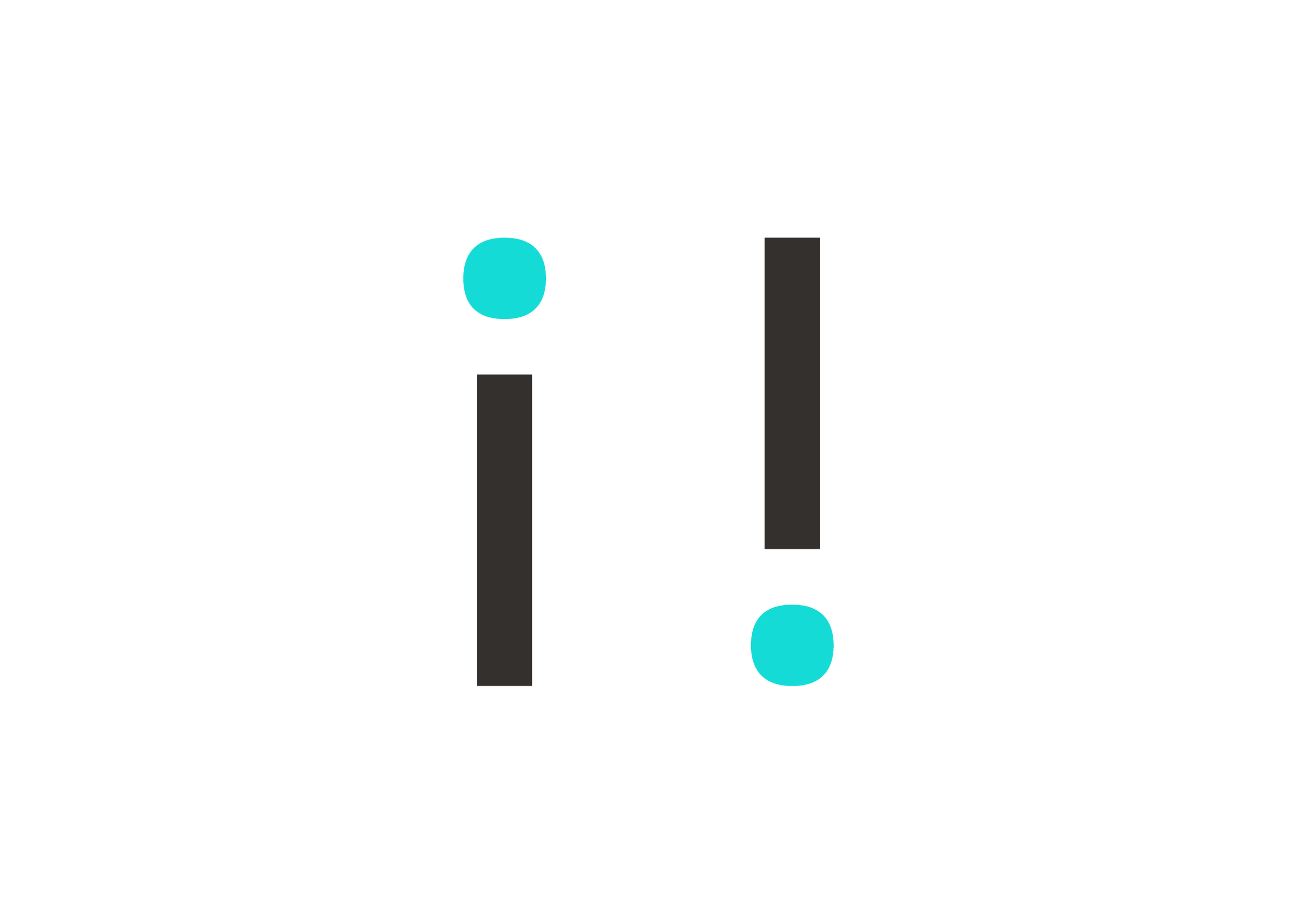
Spain Remote, a company dedicated to helping remote workers from North America relocate to Spain, commissioned me to design a logo for their new business. In developing the logo, I tried to convey a sense of professionalism and reliability while also subtly hinting at the adventure of moving to Spain. I used a vibrant Pantone solid to give the wordmark and isotype a sense of dynamism and energy. I was able to incorporate the upside down exclamation points, a symbol of Spanish language and culture, into the wordmark and isotype.